
Nikki Cornelius
Nikki is the COO of Frontier Marketing.

Capitalize on Color in Marketing to Boost Your Business
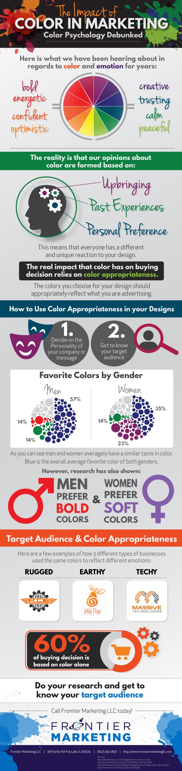
There’s no doubt about it: Color in marketing affects your bottom line. Advertisers have long used colors to attract customers.
Color responses account for 60 percent of the acceptance or rejection of a product or service, psychologists suggest. On average, the buying decision is made within the first 90 seconds.Because color is the first thing we see when looking at a product, it is still the most important factor in marketing. This goes for a package design, logo, website, or advertisement.
When building your brand, website, or even an ad, it is important to do your research and choose the most appropriate color combinations to represent your brand’s personality.
But what exactly are the best colors? The field of color psychology looks at the impact of different colors, but there is some debate about the science behind the conclusions.
Research shows that reactions to colors vary widely. Our experiences shape our opinions of the world around us. Whether we are aware of them or not, they will determine our emotion to certain colors.
Still, there is plenty to learn about the best strategies for color in marketing.
What Does Color Psychology Say?
Color psychology suggests that warm colors such as yellow, orange, and red give off a bold, confident, and optimistic feeling. Blues and other cool colors are thought to convey trust and calm, on the other hand.
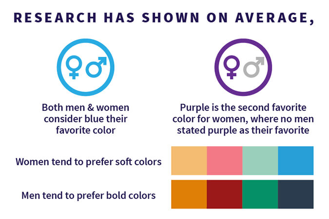
Color psychology points to gender similarities as well as differences:
- Research shows that, on average, both men and women consider blue their favorite color.
- The next-best color for women is purple, but no men stated purple as their favorite.
- Other findings show women prefer softer colors, while men favor bold colors.
What can you draw from this? You may want to avoid purple when targeting male customers, for instance. Also, keep in mind that using a bolder or softer hue is a good way to reach your target audience.
Context is Everything: Match Your Industry
While color psychology is something to keep in mind, it’s not the final word, says Frontier Marketing Graphic Designer Jackie Malinowski.
“It’s a powerful tool, but it’s not a set of rules that are unchanging and that you need to follow,” she explains.
For example, red and yellow are often used by fast-food outlets because these colors are thought to stimulate the appetite. If you’re a fine-dining restaurant, however, red and yellow would be the wrong look, Jackie notes.
Instead, Jackie urges business owners to think about their brand. “How do you want to come across? Look at your overall industry to get a sense of what colors work well.”
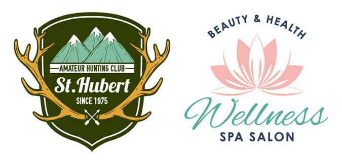
Colors and patterns for a hunting gear business, for instance, should match hunters’ love of the outdoors. You won’t want elegant themes in those ads and flyers. It just would not sell.
On the other hand, a high-end beauty product line wouldn’t even consider using the same colors as a hunting or outdoorsy brand.
A product with an often-disliked color will sometimes sell well. Many people would put the color brown low on their marketing lists. The exception? When your product is organic and natural. This color, if used appropriately, could actually draw the attention of your target buyer.
Consistency Counts
Whatever your colors, make sure your branding is consistent, Jackie advises.
There should be a consistent look throughout your signs, website, ads, flyers, and all other materials. When someone picks up your ad, there should be no doubt whose business it promotes.
Jackie adds these other tips:
- Choose a small number of key colors and stick with them.
- If you like to show a lot of colors, use three or four as your primary palette, with other colors used in very small amounts.
- Having eight or more prominent colors may create a chaotic look.
“Keeping the color palette consistent is more important than color psychology and symbolism,” Jackie notes.
Keep Things Simple
Above all, keep your designs and colors simple. Colors that appear across from each other on the color wheel show a sharp contrast–an energetic look, Jackie explains.
On the other hand, using colors that are next to each other on the color wheel, such as blue and green, has a calming effect.
Using too few or too many colors can harm your brand. Two to three colors (not counting black and white) often work well.
Get Professional Graphic Design Help from a Pro
Our in-house graphic design team can give you an edge. Whether you need infographics, flyers, social media graphics, web banners, or branded PowerPoint presentations, we can help. Call us at 847-254-0837.


More Chamber News & Knowledge
 What is the McHenry Area Chamber of CommerceMarch 11, 2024 - 6:38 pm
- Remember those who serve while you enjoy Thanksgiving at home in McHenry with loved onesNovember 20, 2023 - 6:33 pm
- Email Marketing for Small Business: Your Strategic GuideOctober 30, 2023 - 2:27 pm
 HOW LONG DO AC UNITS LAST?October 9, 2023 - 8:22 pm
 What to Know About Cleaning Up After a FireOctober 3, 2023 - 1:35 pm
Featured Posts
- What is the McHenry Area Chamber of CommerceMarch 11, 2024 - 6:38 pm
- Remember those who serve while you enjoy Thanksgiving at home in McHenry with loved onesNovember 20, 2023 - 6:33 pm
- Email Marketing for Small Business: Your Strategic GuideOctober 30, 2023 - 2:27 pm
- HOW LONG DO AC UNITS LAST?October 9, 2023 - 8:22 pm
- What to Know About Cleaning Up After a FireOctober 3, 2023 - 1:35 pm


